


I’m a multi-passionate designer working at the intersection of UX/U Design, Web Design, & Graphic Design. My experience spans from SaaS platforms, mobile apps, logos, advertising, websites, and medical packaging. I’ve collaborated with brands including Origin Wireless, Westinghouse, Roche Bros., Redeux Energy, and MFour at Matter Communications. I am always designing with people and usability at the core of every project.
Beyond client work, I channel my creativity into passion projects. I created Manifest – Art & Design LLC to help small businesses and my local community stand out through thoughtful web, branding, marketing, and even social content.
I’m currently looking for a role that challenges me creatively, supports continued growth, and allows me to keep designing experiences that make a meaningful impact.
Problem to solve: At Matter Communications, I was tasked with designing the UX/UI for the Origin Wireless company website. As seen on the homepage, Origin Wireless uses “Origin’s WiFi Sensing™ technology and custom applications transform smart devices into virtual sensors for a true intelligent home ecosystem — transforming the way we work, play, and keep our homes and loved ones safe.”
Originally, the website appeared outdated. It was difficult to understand what the goals of the company were and how Origin Wireless differentiates to their competitors. With this in mind, we were tasked with revamping the website to feel more modern and fresh to their targeted audience, while also clearly describing the purpose of the Origin Wireless brand and why they are the go-to company to utilize for wifi-sensing technology in comparison to their competitors.
Process: I teamed up with the Art Director, Copywriter, Web Developer, & the Video Team to build the improved visual story of the website. My main role was collaborating with the team and the client to ensure we include all the information they wanted to tell their company story in an organized and cohesive experience for the customer.
Planning: Once we agreed on what information was absolutely needed, I then provided advice on other elements they may want to consider.
Site Map: From there, we created a site map on a website called SlickPlan that outlined the structure and information of the website before building out the low-fidelity wireframes.
Low-Fidelity wireframes & UI concepts: Once the sitemap was approved, we moved onto the low-fidelity wireframes, while simultaneously designing the UI concepts of the homepage.
High-Fidelity wireframes: Once the UI was approved, we transferred this style onto fifteen different high-fidelity wireframes that would eventually be turned into the guidelines for the developer to build out the website in WordPress.
Animation: The client also wanted some animations to show how the Wifi Sensing technology functions so I worked with the animator to ensure the videos on the website visually summarized how the technology functions in specific environments.
QA: I worked directly with the developer to ensure the website matched the wireframes, while also QAing the website to ensure there were no bugs or any mistakes before the launch date.
Concepts: We shared three different concepts with the client using the UI of the homepage as an example before building out the interior pages (see the other two concepts at the bottom of the page). The client loved that we utilized their secondary color palette vs. the original brand colors, teal & black in order modernize the website. They also loved the use of circular shapes and lines to visualize invisible wifi-sensing technology, which is why this concept was chosen in comparison to the other two concepts.
To learn more about the final UX / UI design of the website, visit https://www.originwirelessai.com
Problem to solve: At Matter Communications, I was tasked with redesigning the UX structure of the original MFour website. We worked with the client to better understand their goals, which included the company wanting to highlight the benefits of the MFour SaaS platform. They also wanted to visually tell the MFour story and why their SaaS platform is the most innovative platform in the marketing industry.
Process:
Planning: We worked with a few team members from MFour to understand the current strengths and weaknesses of the site.
For example, the original website focused mainly on their services, but did not provide much information about their SaaS platform, which is what they wanted the new website to focus on. As the UX Designer, I rewrote a structural outline of the website that focused more on highlighting the SaaS platform and the other services became secondary.
Customer Interviews: I teamed up with the Strategy team to meet with various customers in order to better understand the strengths of the current website and also the main pain points of the website so we could consider this information when building out the UX of the website.
Outline & Site Map: I collaborated with the strategy team and the copywriter to outline all the information needed in the new website using notes from the planning process and customer interviews. Once the outline was created, I transferred this information into a site map so the client had a clear understanding of how the website would function.
Desktop low-fidelity wireframes & Mobile low-fidelity wireframes: Once the site map was approved, I started to build wireframes for desktop and mobile in Figma to provide the client with a visual understanding of how the website will be organized and function based on my knowledge of information hierarchy.
Interactive Prototype: From there, I built an interactive prototype in Figma that the client could utilize in order to better understand how a customer could navigate the site.
Concepts: I teamed up with the Art Director & Graphic Designer where each of us designed an individual concept to present to the client based on a specific idea that represented the company offerings. Although my concept was not chosen, the client liked the idea of using screenshots of the actual platform to showcase to the customer, while also utilizing illustrations of graphs and charts so the customer has a general sense of what the SaaS platform provides at first glance.
To learn more about the final UX / UI design of the website visit https://mfour.com
These wireframes were interconnected in Figma to guide the client through the UX of the website.
I got the opportunity to present this to the client as a potential UI option utilizing their brand guidelines. I mainly incorporated graphs and charts to visually represent what the company does, which is gathering data and statistics in their MFour SaaS platform of consumer shoppers.
Overview
One of my key contributions at Emergo by UL has been designing the Regulatory Affairs Management System (RAMS) platform. RAMS is a software solution that allows medical companies to access both free and premium regulatory services in a single digital space. The platform enables users to track registered medical devices by account or country, while also generating and managing essential regulatory reports directly within the system.
As RAMS continues to evolve, new features and services are regularly introduced to enhance its functionality. My role involves collaborating with other designers and the Product Owner in a two-week sprint cycle to design and refine these new features for development based on a user story and the design system.
Problem to Solve
Our Product Owner requested the creation of a Product Classification Tool within RAMS to help users determine the classification of their medical devices.
Process
The PO provided initial details on the tool’s purpose and the key classification questions.
Using the RAMS style guide, I designed a user-friendly workflow that guides users through a step-by-step classification process.
Once the user completes all required steps, the system determines and displays their device classification.
Concept
Below are examples of the Product Classification Tool interface, along with additional screens showcasing the desktop version adapted for tablet and mobile.
Project Overview:
Tasked with developing a Remote Control App for an Insulin Pump, tailored specifically for patients with Parkinson’s Disease, this consultant project was driven to create a user-friendly interface for individuals facing motor and cognitive challenges.
Design Process:
Deep immersion into the world of Parkinson’s patients served as the foundation of this problem to solve. Recognizing the demographic skew toward older age groups, extensive research was conducted to grasp the nuances of the disease and its impact on user interaction. Leveraging insights from the client's recommended workflow, I refined concepts to cater to the unique needs of this user group. I reached out for valuable feedback to ensure the delivery of a premium-quality product.
Design Concept:
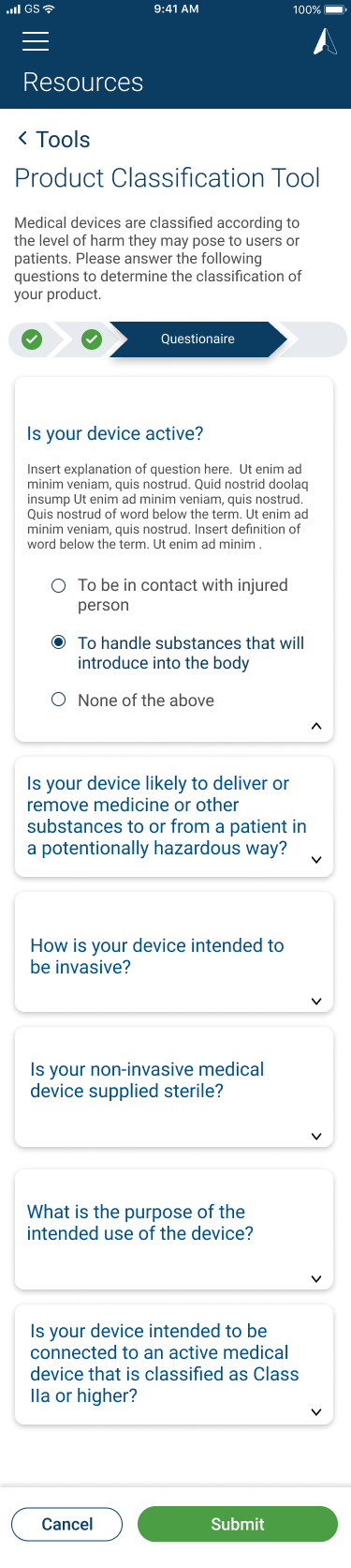
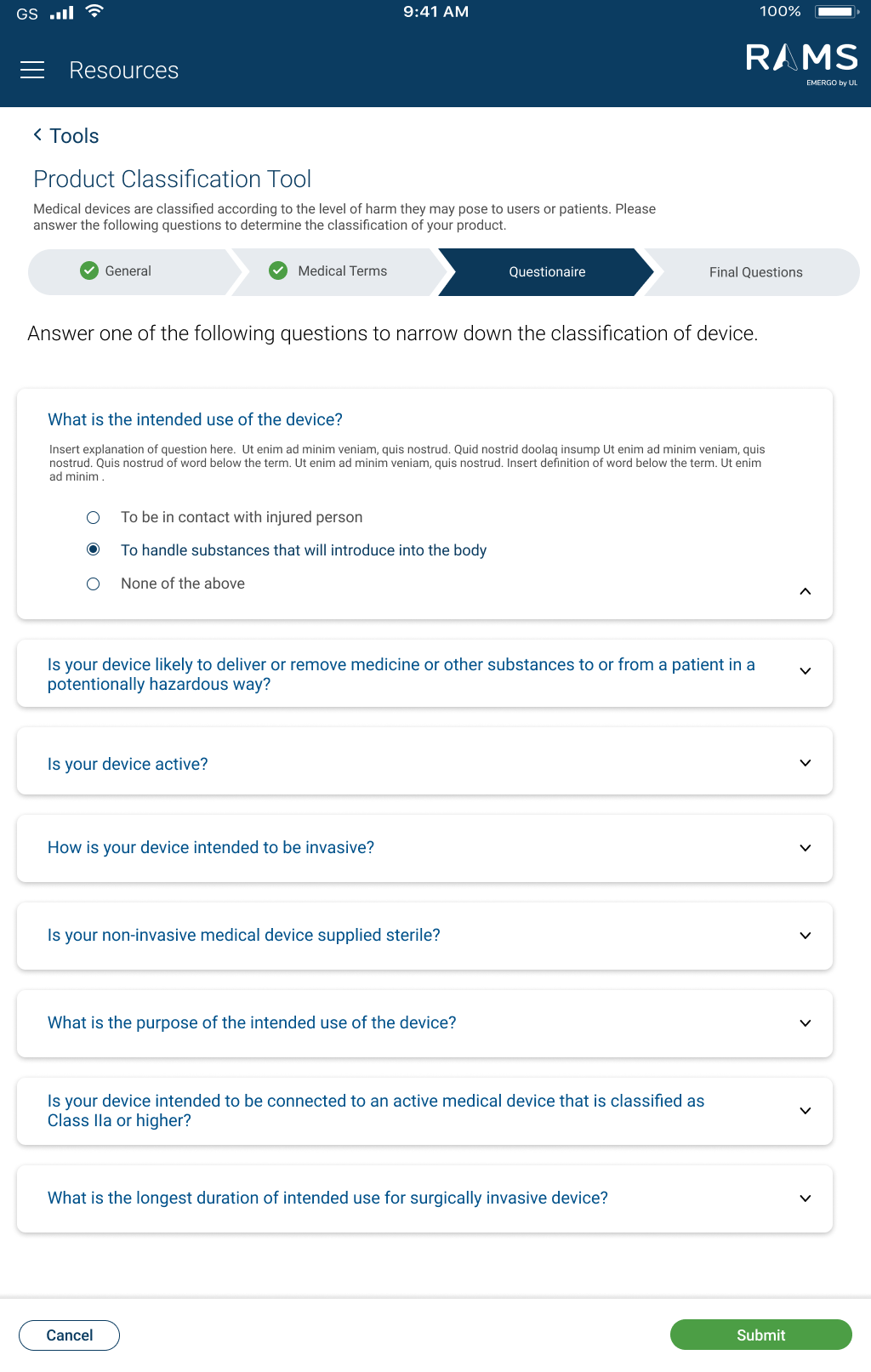
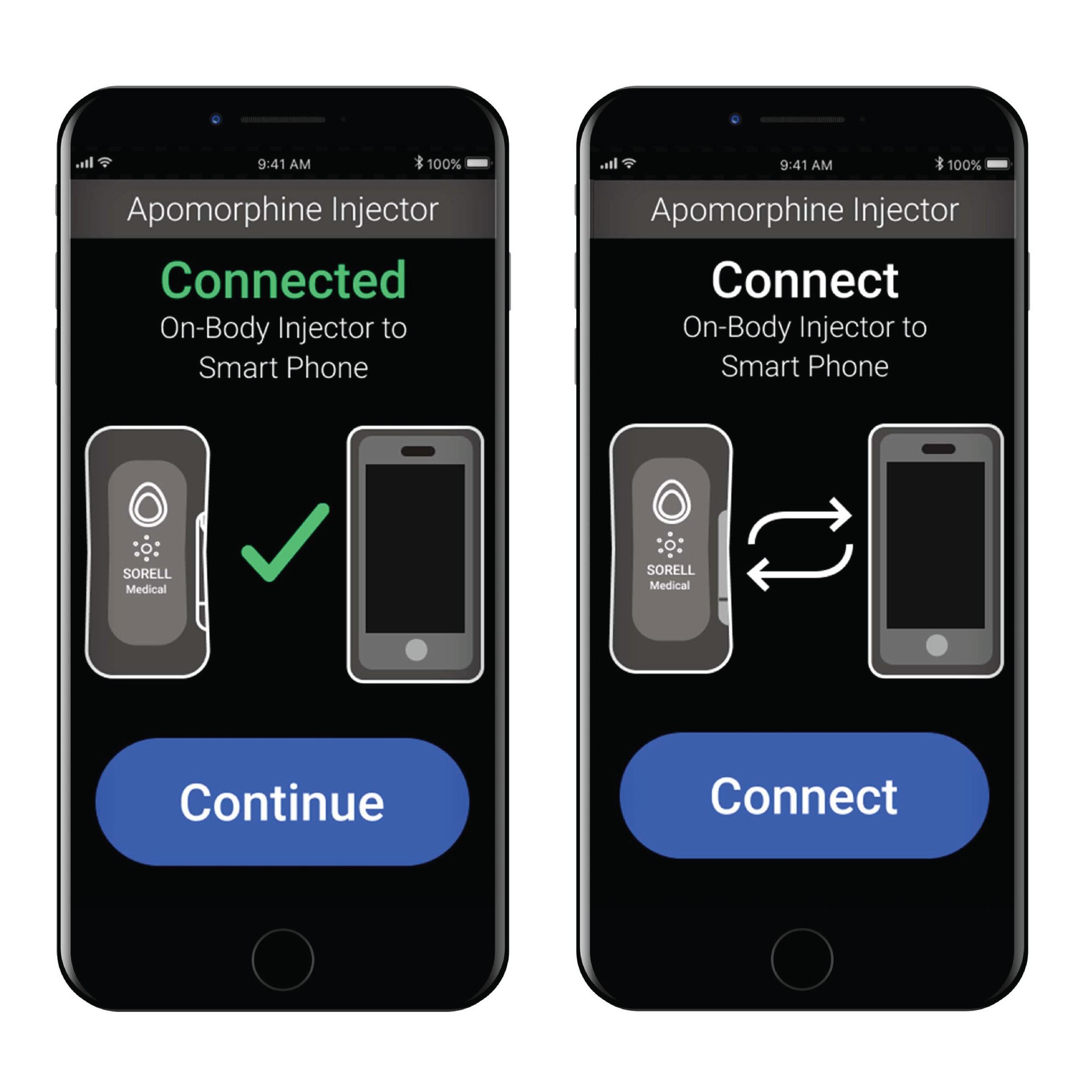
Central to the design ethos was a profound understanding of the end user. Acknowledging the motor difficulties experienced by Parkinson’s patients, I prioritized accessibility by enlarging touch targets, facilitating ease of interaction amidst potential tremors.
- Vibrant, high-contrast color schemes were meticulously selected to enhance visibility and aid in intuitive navigation, catering to the visual needs of an older demographic.
- To further streamline usability, a color-coded system was implemented, providing clear visual cues for differentiating between actions.
- Guided workflows were integrated seamlessly into the interface, empowering users with clear directives at every stage, a vital feature for individuals navigating unfamiliar technological terrain.
Step 1: Gathering client references
Step 2 - Concept Iteration: I screenshotted the original Figma board so you can see how I started to iterate concepts based on the client references that were given to us. As you can see, I created various ways to design each screen until I determined the best solution. I also kept track of components (buttons, icons, graphics) on the upper left hand of the board to ensure I am using the same components for each screen.
Step 3 - Narrowing down concepts: Once I received some feedback from other designers, I started to consolidate and revise some of the screens in order to narrow down to the best solution.
Step 4 - Final Concept: The following screens are the finals screens after delivering to the client and revising the screens based on any additional feedback we received.
Final screens workflow
Problem to Solve
Sleep deprivation in office environments is a growing issue that affects productivity, focus, and overall well-being. To address this challenge, I designed a conceptual product and brand called The Koala, aimed at supporting short, restorative rest within the workplace.
Process
This project was developed over a 10-week period in close collaboration with a Design Director and Senior Designers. The process began with research and ideation, including audience analysis and mood board development focused on white-collar professionals. From there, I explored and iterated multiple product and brand concepts through sketching and refinement. The final deliverables include a complete brand system, logo design, website landing page, and campaign strategy.
Design Concept
The Koala reimagines an affordable, office-friendly sleeping pad that can be easily integrated into modern workspaces. The name and visual identity draw inspiration from koalas, one of the sleepiest animals, resulting in a simple and approachable logo that reinforces the product’s purpose while maintaining a professional tone.
A visual representation of what the Koala product would look like.
An additional campaign strategy for the Koala company.
Project Overview
This project focused on redesigning a critical hospital application used to screen newborns’ hearing. The goal was to improve usability and efficiency for medical professionals while supporting a clear, reassuring experience for families during a sensitive moment of care.
Design Process
Using insights from previous application iterations, established brand guidelines, and the hearing screener manual, the redesign was grounded in clarity, consistency, and thoughtful organization. In close collaboration with the Senior Designer, I contributed to structuring the application’s information architecture and developing a cohesive component library. A key priority was streamlining core workflows, whether clinicians were conducting screenings or managing patient data.
Design Concept
Guided by the client’s brand palette, we selected a calming teal blue to convey trust and reassurance, aligning with the emotional context of newborn hearing screening. High-fidelity wireframes were designed in adherence to UI best practices and accessibility standards, resulting in an intuitive, consistent workflow that supports efficient navigation across the application.
This application featured two distinct workflows: the clinical pathway and a streamlined quick test flow. The latter offered healthcare professionals the flexibility to expedite the process by skipping certain steps, enabling efficient screening, while also maintaining accuracy and thoroughness.
Problem to Solve
This project involved creating and designing two instructional manuals for a syringe and drug vial adapter kit. The primary goal was to clearly guide caregivers through the step-by-step process of preparing and administering an injection using the vial kit, ensuring accuracy, safety, and ease of understanding.
Process
I collaborated closely with the Senior Designer and User Researcher to define and document the injection steps from a caregiver’s perspective. Our approach combined use-related risk analysis with subject-matter expertise in injection workflows to ensure clarity and compliance. Once the steps were finalized, the Senior Designer structured the content hierarchy, and I led the creation of the illustrations. I was main contributor in determining what visual information was most critical to show at each stage of the process.
Design Concept
We presented three layout concepts to the client. The selected three-row format effectively separated information by function: the top row for standard Instructions for Use (IFU) content, followed by two rows dedicated to step-by-step visuals and guidance. This structure improved readability and helped users quickly process complex instructions.
Problem to Solve
As part of a typography course, I was tasked with designing a booklet that explores and represents two well-known typefaces through layout, hierarchy, and visual storytelling.
Process
I began by researching the International Typographic Style to establish a clear visual direction for the booklet. Using these principles as a foundation, I explored multiple layout and typographic concepts for each page, iterating until the most effective solution emerged for both clarity and visual balance.
Design Concept
The final booklet applies the structure and restraint of the International Typographic Style while highlighting the unique characteristics and history of each typeface. The selected pages shown reflect a cohesive system that balances form, function, and narrative through typography-led design.
Overview
As part of the UL Identity Management Security team, I participated in an intensive one-week sprint to help design a new platform for their Safe Cyber Security system—a compliance and security posture management platform. In simpler terms, this platform enables companies to assess whether their products meet security and compliance standards through rigorous testing and evaluation.
One of the key features I worked on was the Firmware Device System, which allows device manufacturers, system integrators, and suppliers to detect potential security risks in their firmware products. If a product fails an assessment, the system identifies specific vulnerabilities and provides insights into the issues that caused the failure.
Design Process
To develop an intuitive and effective user experience, I collaborated closely with the team to:
Define user needs and requirements.
Ensure the platform provided clear and actionable insights into security vulnerabilities.
Develop a user-friendly interface that streamlined the assessment process.
The final design allows users to efficiently analyze firmware security, interpret assessment results, and take necessary actions to enhance product safety.
(See screenshots for detailed process visualization.)